

Background
What is Tumbao Collective?
When I first attended Tumbao’s donation-based Latin dance class on Tuesdays, I was expecting a more traditional ambience, but boy was I wrong! I soon discovered their mission of building diverse community echoed by teaching anyone to be a lead or follow, diminishing the gender binary while welcoming all ages and incorporating different cultural traditions into the lessons. This appealed to me since I aimed to emulate these same attitudes in my teaching and creative career.
When Tumbao needed help rebranding, designing a responsive website, and getting more people interested in their dance events, I salsa’ed on board!
As the UX Designer for Tumbao Collective, I created a website as creative and fun as this dance collective.
ROLE: UX Designer
PLATFORM: Web
TIMEFRAME: March 2022 - July 2022

Empathize
How might we highlight Tumbao’s far-reaching ethos while optimizing the experience of their dance class attendees, induce excitement about dance, and create a donation structure?
Problem
The current website has little to no architecture and does not support Tumbao’s goals of community engagement, artistic collaboration, and an easy way to donate. A re-design will give these goals room to boogie!
Goal
Cultivate excitement about dance and a sustained desire to join this community by showcasing its fun and welcoming nature.
Dancing in the users’ shoes


“I never know when the next dance class is till I check their instagram.”
-Walter
“Adding Spanish to the site would help people like me who only speak Spanish.”
-Anna
“I want to know more about Tumbao’s art collaborations.”
-Megan
“I’d like to donate more money but don’t know how.”
-Ethan
Who dances better?
Shimmying my way through Louisville’s dance class scene informed my decisions to highlight Tumbao’s budget friendliness, how it can make more money, and ways to grow its community.

Taking a beat to observe
I documented my experience of attending Tumbao’s dance classes, including: the light-hearted temperament of the instructors, anxiety and excitement about dancing, and the atmosphere of the dance floor.

Twirling around other perspectives
I explored the range in Tumbao’s community by interviewing different archetypes


How might we encourage these personas to attend the next Tumbao event?


Define & Ideate
Keeping dance fun by adding intuitive categories
Our target audiences were students, Spanish-speakers, and creatives. To ensure they could each find what they were looking for, I focused on these main areas:
Landing page with main navigation, intriguing video, and other discoverable content
Clear and concise mission statement
Prominent calendar button
“Donate” call to action
Ethan’s Task Flow
Ethan discovers the details about salsa class this week and donates in the process.

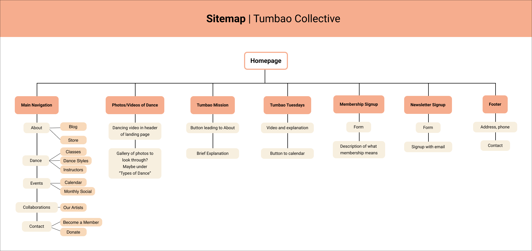
Organizing the necessary elements
To demonstrate the information architecture through a sitemap, I conducted a card sort where users organized elements like “Blog,” “Store,” and “Calendar,” under pages like “Home,” “About,” and “Contact.”

A Visual System
A more colorful and engaging brand
Logomark
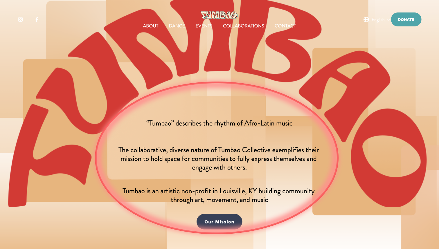
Tumbao’s logomark contains its theme colors, a reflection of the Afro-Latin music where its name comes from. The circular shape is reminiscent of the circle dancers stand in during dance class while watching the instructor in the middle.
Color
One of Tumbao’s founders had artistically designed their logo so I started to create visuals based off of that. I knew contrast would be key to a colorful but structured site and I edited photos into black and white to stand out against the colorful backgrounds.
Wireframes
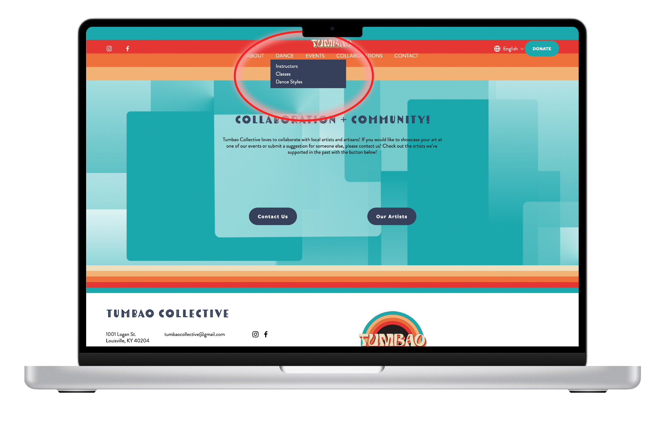
The most intuitive categories for users included broad headings like “About,” “Dance,” “Collaborations,” etc. with sub-headings like “Instructors,” “Dance Styles,” “Our Mission,” etc. Since the motif of Tumbao’s circular brand was so prevalent, I included circular elements in categories most important to users.


Desktop & Mobile
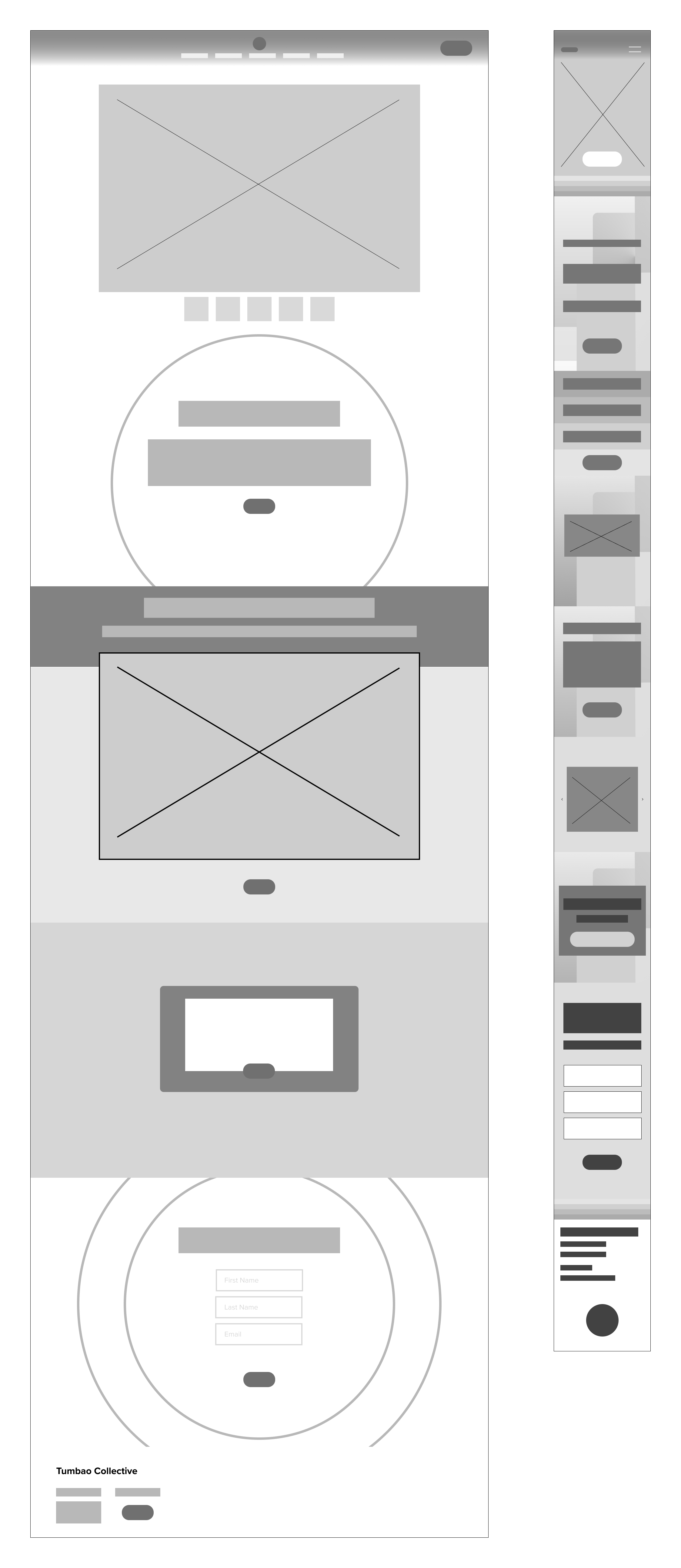
Creating backgrounds and instructor profiles

Guidelines for hand-off
These master components and guidelines helped me explain how Tumbao could edit and add to the design in the future.

High Fidelity Wireframes
Now that I had designed the structure of the site and sorted the categories in the most intuitive way for users to understand, all I needed to do was add color- yahoo! I created backgrounds consistent with Tumbao’s fun, artistic nature, broadcasting their bold color choices throughout the site.


Usability Testing
Testing to understand frustrations
Objectives
Assess the accessibility of the site by testing color efficacy and language options
Investigate how users find out what Tumbao is, what classes are offered, and how much they cost
Study users’ relationship with the calendar
Explore how users might donate most easily
Accessible for Tumbao’s community
I added the ability to translate the site so that Tumbao’s many Spanish-speakers could use their first language while navigating the site!


“I’d like to connect with the artists involved in Tumbao but am not sure how.”

After
I added a CTA, linking users to Tumbao’s collaborative network.

Before
5/5 users desired the ability to contact Tumbao’s collaborators to discover more art.


“I wish the calendar was easier to use and more beautiful to look at.”


Before
Tumbao’s 4 directors share a google calendar and asked me to integrate it into the site.
After
Users unanimously stated they did not want to have to login to google to access the calendar so we opted into a different calendar format.

Prototype
Key Solutions
Intuitive content organized by categories after testing
Clear and concise ways to donate and collaborate
Conspicuous mission statement
Organized hand-off system
Optimized homepage
How might we help users find out more about what Tumbao offers and discover content more intuitively?
Repeating donation buttons
It seemed intuitive to only include a donation button in the main menu, but it was a breakthrough for me to learn 5/5 users’ eyes didn’t go straight to the main navigation to donate. They wanted to be asked in different ways on different pages.

Finding out WHO Tumbao is
As a teacher, I learned repetition is everything. Making space for Tumbao’s mission to appear on the landing page and other pages throughout the site helped users grasp Tumbao’s purpose and objectives quickly.


Hand off
Designing for Hand-off
How might we make the hand-off process as smooth as possible so Tumbao is able to edit and add to the design in the future?
Final Meeting with Stakeholder
Meet with Stakeholder for a final time to review the site
Create site page with “Rules of the Site” for editing in the future according to branding
Hand-off visuals created during site production along with hex #’s of palette colors

Final Thoughts
Takeaways
Challenges
I was worried about completing the project in the time parameters Tumbao gave so I was only able to do so much research. With more time, I would interview more Tumbao participants and get their feedback on the designs.
Where I improved
I talked to developers, wrote custom css, put my knowledge of color theory to use in the web design world, and communicated often with a live client.
Key takeaways
I learned more about collaborating with a company, problem-solving solutions for a diverse group of people, writing custom css, and creating a responsive website easy for users to navigate.
Next Steps
I can see myself working on projects with a cause in the future because it was a joy to put so much energy toward something I know is benefiting a lot of people.
Track website analytics: are more people attending Tumbao events/is Tumbao receiving more donations?